Cycle of Emotions : Composition
Interactive installation — screen, tablet interface, webcam (FER), sound
Ars Electronica Festival 2026, Campus Exhibition
Linz · September 2026
The final work in the Cycle of Emotions series.
Previously: Cycle of Emotions — Dot, Color, Plane, Flow · G.MAP New Wave, Gwangju, January–April 2026
About the work
This work continues the Cycle of Emotions project, shown at the Gwangju Media Art Platform as part of New Wave. It looks at how emotion is turned into data by algorithms, and how that data can be returned to art.
Its starting point is Wassily Kandinsky’s chain reaction: the artist’s emotion takes visual form as a work, which the viewer then senses and answers with an emotion of their own.

Here the chain begins somewhere else. The viewer’s emotion comes first, and the data it leaves behind accumulates as the work itself — a circulation model in which the viewer composes rather than receives.

There is a screen, and a tablet. On the tablet you choose an emotion — up to three — and give each one a color. They appear on screen at once. A webcam sits above the screen, so the moment you look up to see what you made, it reads your face and takes the emotion that dominates. The screen answers: texture and sound shift as that emotion changes. No image of you is recorded.
The three layers
Whose emotion, and whose color

Front — The Individual Layer
One form for each emotion you chose, in the color you gave it. The webcam decides how large each one grows. None of them disappears.

Middle — The Grid
A mesh of color between you and the ground behind. It holds the emotions you did not choose, and their colors are borrowed from visitors who stood here before you in Linz. It divides but does not close, so the layer behind shows through its gaps. Your own choices pass into it too.

Back — The Background
Soft fields of color with the edges gone. Emotion data from around 1,400 visitors to the Gwangju exhibition, held as representative colors. What sits behind everything is the color for the emotion your face is showing most.
These are not three kinds of thing. They are the same material in three positions, and the position tells you whose it is. The front is yours. The grid belongs to other people. The back has no individuals left in it.
The grid did not come from the data. It arrived while the work was being built, and settled. In a data visualization that would be a fault, since form is supposed to follow from what is measured. Here it is the method.
A camera, and no numbers
The webcam sits above the screen. It reads your face while you are watching — not while you are choosing — and takes the emotion that dominates. That value moves the texture and the sound.
You will not see it. No number appears on screen, no confidence score, no image of your face. Nothing of you is recorded.
This is a decision, not an omission. Put the reading on screen and the work becomes a test — you would check whether the machine got you right, perform for it, and treat its output as the truth of what you feel. The algorithm belongs here as a way of seeing, not as a verdict.
Why this is not a data visualization
Read this before the numbers below
What follows is a lot of numbers: hue bands, saturation means, p-values. They describe the material this work is made of, and they are why the layers look the way they do. They are not a key to the image.
You cannot trace the data back out of what is on screen, and you are not meant to. A visualization is judged by whether the image returns you accurately to the numbers. Here the numbers are raw material, and what happens to them afterwards is a compositional judgment — mine — the same kind a painter makes about a palette. That is the distinction this work is built on, and it is why the analysis sits at the end rather than the beginning.
This distinction is worked out at length in my master’s thesis at Interface Cultures, University of Art and Design Linz.
The Korean Dataset
What colors did Korean visitors give to each emotion?
Between January and April 2026, around 1,400 visitors to Cycle of Emotions at G.MAP in Gwangju assigned a color to each of seven emotions. They left 1,862 responses; after filtering out noise, 746 were used for this analysis. Nothing personal was recorded — each entry holds only a timestamp, an emotion, and a color.
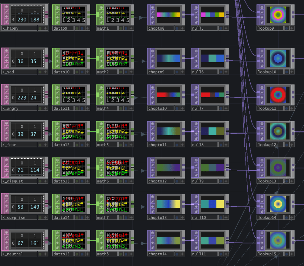
Happiness
#da3cdf#47a78a#4146a5#579c00#e6bc00The only emotion that never settles into one region. Choices spread across five color families at 11–22% each — happiness seems to mean different things to different people.
Sadness
#242359#48a192#3060c9Blues dominate: sky blue (22%), cyan (14%) and blue (13%) together account for 49% of all choices. Darker in tone than most other emotions.
Anger
#df181d#358a61#213ac1#4d312eThe sharpest single association in the dataset — red (25%) and pink (25%) make up half of all choices. Anger is also the most saturated emotion here (S=182). The cool tones sitting alongside the reds are worth a second look.
Fear
#27255a#42b3a5#5d662bHue spreads widely, but brightness does not — fear gathers at the dark end whatever the color. Here how dark seems to matter more than which color.
Disgust
#477234#41606b#4b2883The darkest emotion in the dataset (V=137). No single hue takes over, but the tonal range stays consistently low.
Surprise
#359590#2645bf#eae15cTeal leads on its own (19%). Both brightness and saturation run high, yet red never surfaces — which is what separates surprise from anger in this data.
Neutral
#43a18d#3a47ad#7f9642The least saturated of the seven (S=143). Teal comes first at 16%, but nothing dominates — no strong color seems to come to mind for neutral.
Where the choices fall
Every response sorted into one of twelve 30° hue bands (%)
Three things stand out. Anger concentrates in red far more sharply than any other emotion does anywhere on the wheel. Sadness sits almost entirely in the blue family. And surprise and neutral — two emotions with little else in common — both peak at teal.
The choices are not random
Chi-square test against an even spread across the twelve bands
If visitors had picked colors without regard to emotion, responses would fall evenly across the twelve hue bands. They do not.
Four emotions fall below p<0.001. Fear and disgust show weaker figures largely because their samples are smaller.
Still gathering
The colors above are one audience, in one place, over four months. A second set is planned from visitors in Linz, to sit beside the Korean dataset rather than replace it. What the two have in common, and where they part, is the part that has not been written yet.

